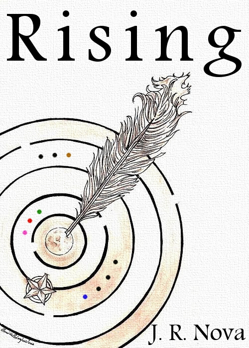
A big, huge thanks to Camille Pedraja for taking the time to redesign this a bit. This is my final cover for "Rising", which should be published in a week or so, if all goes well and I don't run into formatting and technical issues.
This is Camille's redesign. As you can see I took some liberties with it, turning the "target" design into a maze, adding the dots, as well as the cloth background. It was her idea to put my name in the bottom right corner and get rid of the "By". We collaborated well together in the end, but we were not the only ones with ideas. If Aaron Sawyer (who is a pretty good cover artist himself!) and others hadn't spoken up about the original, we would have never tried for another version.
This was the best draft of our "first" design. I like it, but there are obviously problems with it and overall it just doesn't do anything for me.
I manipulated nearly two dozen separate covers trying to find the right one. It was a lot of work getting this cover done, but Camille and I finally did it, and really like what came out.
Art, whether it's writing or drawing, is a lot of trial and error. There's a lot of work that goes into making even a passable product. I don't know if the "Rising" cover is great or just average, but the work was well worth it.
It is very rewarding knowing you've done the work, and can be satisfied with the result. For a perfectionist like me, being satisfied with anything is a great big step up in the world!


Wow J.R.! Looks like you are on your way!
ReplyDeleteI see (from a previous post) that you have some great inspiration for your fiction!
Thanks for stopping by, Debra! I have lots of inspirations :D
DeleteHello.
ReplyDeleteWoW! I'm loving the final cover. It's fun seeing the before & after. Very nice job & all the best with publication!
Thanks for sharing.
I agree, it's great to see how things evolve!
DeleteI like the final cover design, JR! Nothing good comes easy, right? Wishing you the best on your novel! :-)
ReplyDeleteThanks, and I think you might be right. Anything worth anything is worth working for :)
Deletewow.... cover looks great Nova !!
ReplyDeleteu really put lotz of efforts and it is looking in your work :)
All my best wishes to u
hope everything goes as planned :)
I like the way the covers evolved. Way cool. Thanks for sharing the story.
ReplyDeleteThis is a great cover!
ReplyDeleteThanks everyone :)
ReplyDelete